2026 Best Way to Choose the Right Foundation Shade Online?
Choosing a foundation online can feel like matching a wall color under changing light. Product photos may look accurate, yet your screen settings can alter every undertone. This guide explains how to choose the right foundation shade online using practical comparisons, reliable brand tools, and careful observation of your skin.
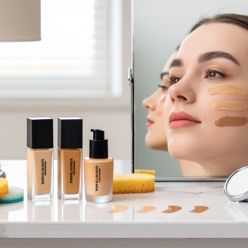
Professional makeup artist Bobbi Brown has said, “The right foundation shade is the one that disappears into your skin.” That principle remains useful in 2026. Look beyond labels such as “light,” “medium,” or “deep.” Compare the foundation against your jawline, not your hand. Your face may appear slightly darker than your neck, especially after sun exposure. Check whether your undertone looks warm, cool, neutral, or olive. Veins can offer clues, but they are not a perfect test.
Lighting matters greatly. Review swatches beside a window, then check them indoors. Read recent customer reviews, especially from people with similar undertones. Brand shade finders can help, but they may recommend nearby shades rather than exact matches. Sampling remains the safest choice. If returns are available, order two close shades and test small stripes along your jaw.
There is no flawless shortcut. Even experienced artists can misjudge a shade from a screen. I have found that oxidation can change a match after several minutes, which is easy to overlook. Wait before deciding. A slightly imperfect match can often be adjusted with concealer or bronzer, but a visibly wrong undertone is harder to correct. This evidence-led approach makes online shopping more dependable, without pretending that digital color is perfectly accurate.
Define Skin Depth with Fitzpatrick’s Six Phototypes and Three Undertones
Choosing foundation online starts with skin depth, not a product label. Fitzpatrick’s six phototypes classify how skin responds to ultraviolet exposure. Type I usually burns easily, while Type VI rarely burns. This scale helps narrow your depth, but it is not a perfect color chart. Type IV, for example, can include several different skin tones. Season, tanning, and facial redness can also shift your appearance. Check your jawline in daylight, not your wrist.
Then identify your undertone. Warm undertones often show yellow, golden, or peach hues. Cool undertones may appear pink, red, or bluish. Neutral undertones balance both sides. Olive skin can look muted green or gray and is often mistaken for neutral. Look at your neck and jaw together. Vein color alone can mislead you. Light changes everything.
Take an unfiltered photo beside a window, with a clean face and a white shirt. Compare online swatches with your jawline, not your hand. Check whether the shade description mentions depth and undertone separately. A shade may look correct on-screen but appear too orange outdoors. I have made that mistake. Screens deceive. Lighting, camera settings, and oxidation can alter the result. If possible, choose a seller with clear sample options and a transparent return policy. That small safeguard makes online matching more reliable.
2026 Best Way to Choose the Right Foundation Shade Online? — Define Skin Depth with Fitzpatrick’s Six Phototypes and Three Undertones
Use Fitzpatrick phototype to estimate how skin responds to ultraviolet exposure, then use visible depth and undertone to narrow an online foundation match. Fitzpatrick type is not a foundation shade number: two people with the same phototype may have different skin depths, undertones, tanning histories, or surface redness.
| Fitzpatrick Phototype | Typical UV Response | General Skin-Depth Tendency | Online Visual Clues | Best Digital Swatch Check | Common Matching Error |
|---|---|---|---|---|---|
| Type I | Always burns easily and generally does not tan. Often associated with very fair skin. | Very fair to fair | Skin may appear porcelain, pink-beige, or very light ivory. Facial redness can make the surface look deeper than the neck. | Compare a light shade against the jaw and neck in indirect daylight. Avoid selecting a shade solely because it reduces visible redness. | Choosing a foundation that is too pink or too dark to neutralize redness. |
| Type II | Usually burns and tans minimally. Skin may become slightly darker after repeated exposure. | Fair to light | Common visual ranges include light ivory, light beige, and pale peach-beige. Freckles or flushing may affect the apparent surface color. | Check whether the shade disappears across the jawline rather than matching the reddest part of the cheeks. | Using a very pale shade with a strong pink cast when the undertone is actually neutral or warm. |
| Type III | Sometimes burns and usually tans gradually. The tanning response can vary widely within this group. | Light to medium | Skin may look beige, golden-beige, peach-beige, or olive-leaning. Seasonal tanning can move the face into a deeper range. | Compare two depth options and inspect them after several minutes; oxidation can make some formulas appear darker or warmer. | Confusing a golden or olive undertone with a foundation that is simply too yellow. |
| Type IV | Burns minimally and tans readily. Skin often develops a noticeable tan with exposure. | Medium to tan | Common visual ranges include medium beige, golden tan, olive-tan, and medium brown-beige. | Match the central cheek, jaw, and neck together; do not rely on the hand, which may differ in exposure and depth. | Selecting an overly orange shade to compensate for a neutral or olive undertone. |
| Type V | Rarely burns and tans profusely. Skin usually contains a deeper natural melanin level. | Tan to deep | Skin may appear deep golden, bronze, reddish-brown, or olive-brown. Areas of the face can vary in depth. | Use a daylight photo with no beauty filter and test the jawline, forehead, and neck because facial pigmentation may not be uniform. | Choosing a shade with enough depth but the wrong undertone, producing a gray, orange, or red appearance. |
| Type VI | Typically does not burn. Skin is deeply pigmented and may still develop visible variation from sun exposure. | Deep to very deep | Visible depth may range from rich brown to very deep brown, with neutral, warm, cool, or olive-leaning appearances. | Look for a formula with sufficient depth and compare it with the neck and upper chest in neutral daylight; check for an ashy finish after drying. | Assuming all deep shades are warm, or choosing a lighter shade that creates a gray cast instead of matching the skin. |
| Undertone | Typical Visual Direction | Useful Online Indicators | Foundation Comparison | Warning Sign of a Mismatch |
|---|---|---|---|---|
| Cool | Pink, rosy, red, or bluish-red cast beneath the surface. | Silver jewelry may appear harmonious; veins can look blue or purple, although vein color is only a rough clue. | Compare a neutral shade with a subtly rosy shade at the jawline. The correct option should not look distinctly pink after blending. | The face looks noticeably pink, gray, or ruddy compared with the neck. |
| Warm | Yellow, golden, peach, or warm-red cast beneath the surface. | Gold jewelry may appear harmonious; skin can look more golden in daylight. Surface redness does not automatically mean a cool undertone. | Compare a neutral shade with a subtly golden or yellow shade. Select the one that merges with the neck without turning orange. | The complexion looks orange, strongly yellow, or darker than the neck after the formula dries. |
| Neutral | A balanced mixture of cool and warm qualities, without a clearly dominant cast. | Both silver and gold jewelry may work; veins may appear blue-green or difficult to classify. | Start with a neutral shade at the correct depth, then compare adjacent warm and cool options if available. | The foundation pulls distinctly pink, yellow, orange, or gray even when the depth seems correct. |
FAQS
It captures subtle hue, value, and undertone differences better than broad labels.
Apply a narrow stripe along your bare jawline, not your wrist or hand.
Your complexion may appear pink, golden, olive, or neutral.
Apply it to clean, moisturized skin without heavy makeup or strong sunscreen.
Foundation may darken or become warmer after reacting with air, oils, and skincare residue.
Natural daylight reveals orange, gray, or overly pink tones more clearly than artificial light.
Gray may indicate an overly cool shade. Orange may suggest an overly warm shade.
Photos help record changes, but camera settings and screen calibration can distort color.
Consider a lighter shade with a similar undertone, then repeat the daylight test.
Patch testing is sensible, especially when skin feels sensitive or newly exfoliated.
Conclusion
Learning how to choose the right foundation shade online starts with understanding your skin more precisely than simply calling it light, medium, or deep. First, identify your approximate depth using six phototype levels, then determine whether your undertone is cool, warm, or neutral. Next, compare your complexion with a standardized 110-color skin-tone reference to narrow down your likely shade range. When possible, select three close matches and assess them along the jawline, cheek, and neck rather than on the hand, where skin color may differ.
For greater accuracy, compare digital color values using the CIE L*a*b* system and aim for a color difference close to ΔE00 2.3 or lower. Online lighting, camera settings, and screen calibration can affect your judgment, so treat these measurements as guidance rather than an absolute guarantee. After applying a candidate shade, wait 15–30 minutes and recheck it in natural daylight. This final step helps reveal oxidation and confirms whether the foundation remains seamless with your face and neck.